RISE Foundation is a 501(c (3)organization that seeks to improve the community by providing financial literacy tools and incentives to help families build assets and make better financial choices.
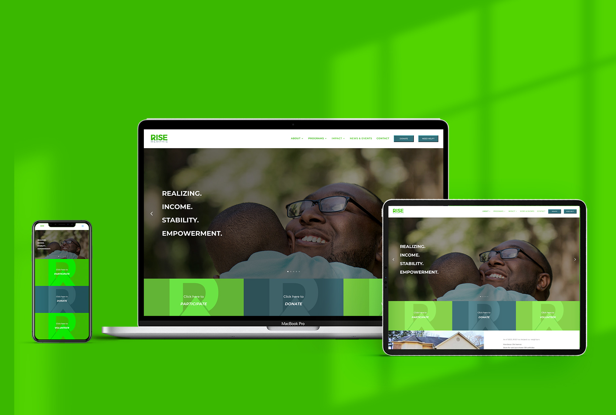
Branding | Web Management
FIND THE PROBLEM
RESEARCH
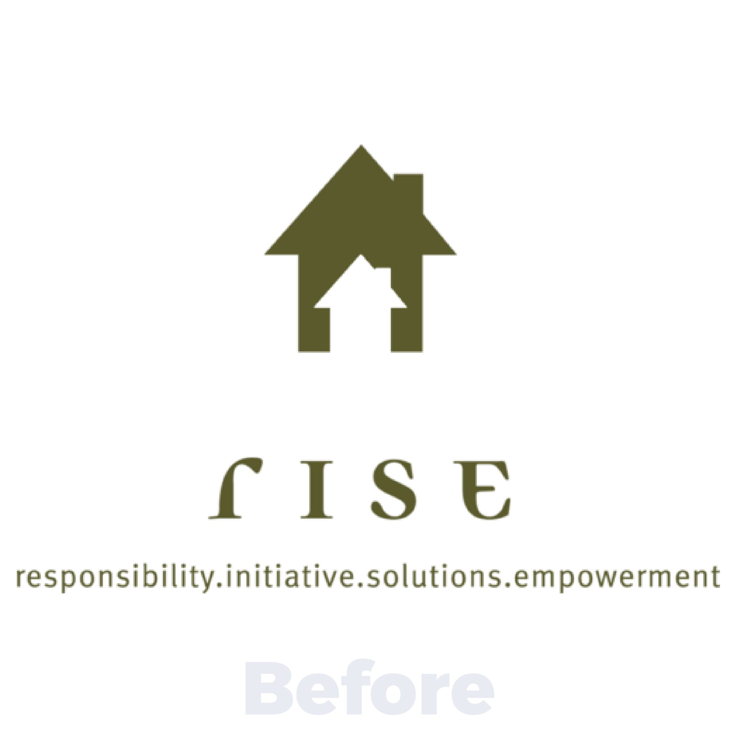
RISE engaged with KQ on a rebranding project to create a new visual identity and acronym for name. During the research phase we found that the previous acronym and logo did not reflect the organization’s actual work in the community. Our goal was to create a new brand that captured how RISE excels in the financial literacy space.
CREATE A PLAN
DEVELOP
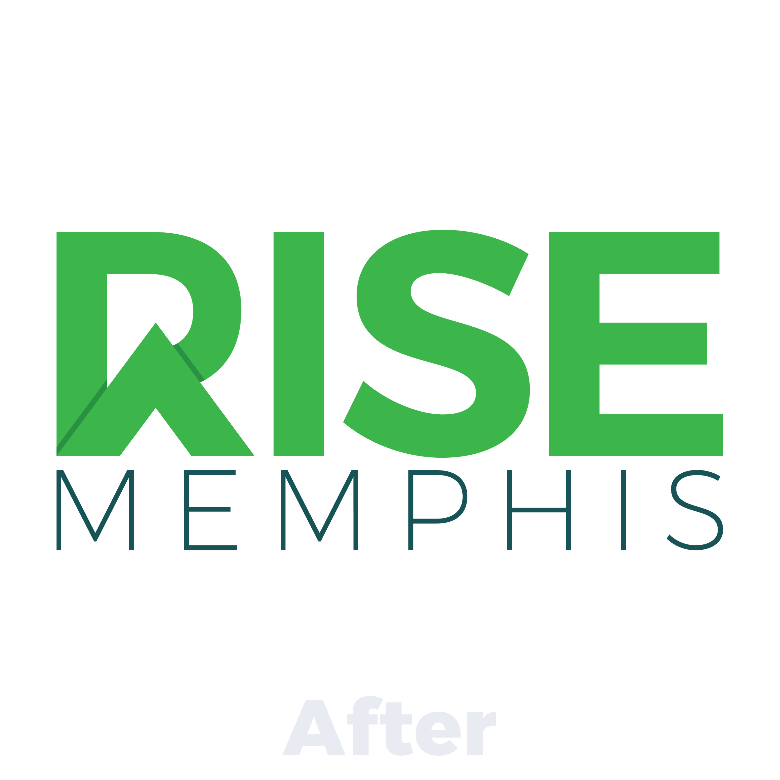
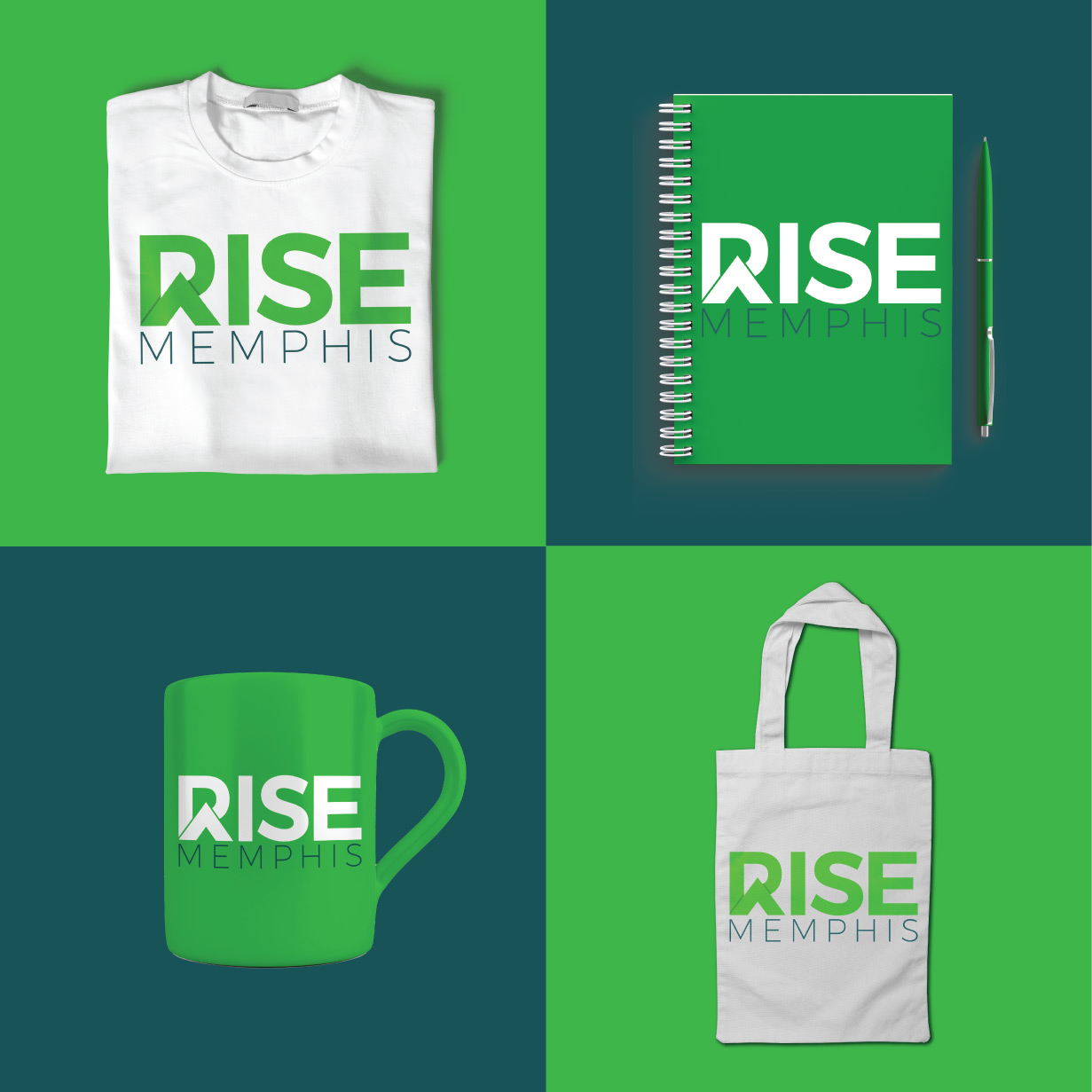
KQ began the rebranding project by conducting a renaming exercise. RISE previously stood for Responsibility. Initiative. Solutions. Empowerment. KQ developed a new acronym for RISE, Realizing Income Stability and Empowerment, that better reflects the grassroots approach that RISE takes when it comes to not only providing financial literacy education but also the tools and resources necessary to turn that knowledge into action. The new RISE logo incorporates an arrow pointing up into the wordmark to show that as individuals gain financial stability and independence, their families and communities will rise.
Logo
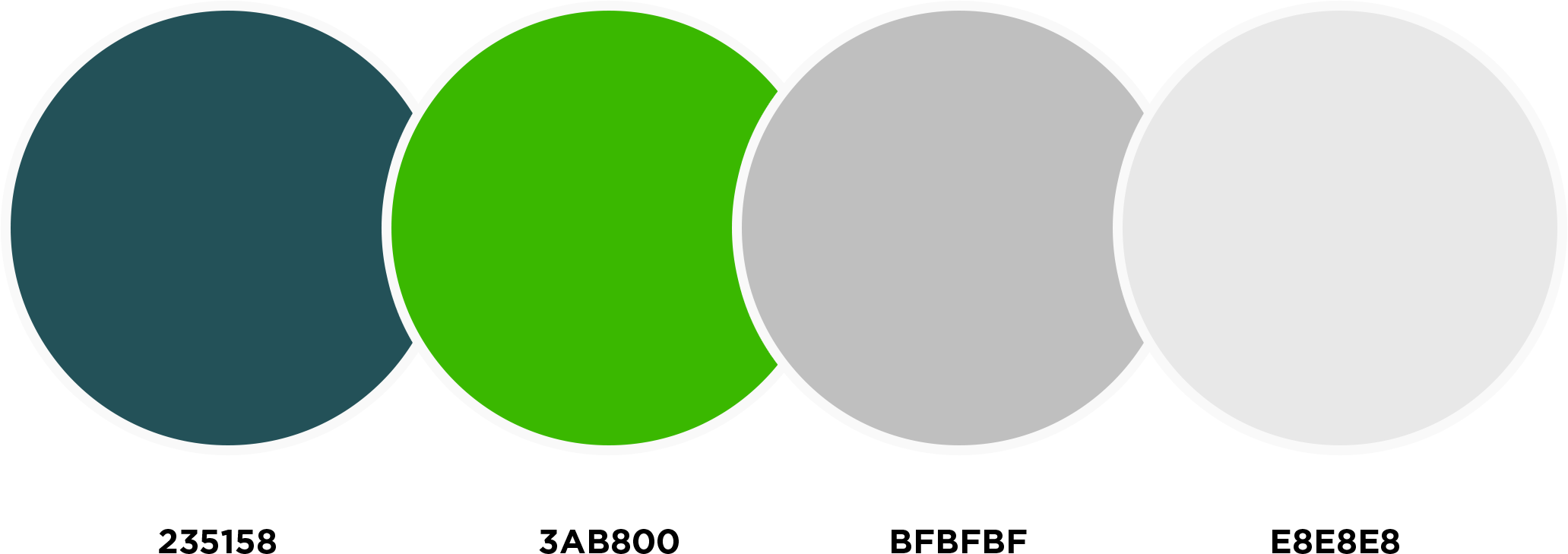
Color Palette
EXECUTE RESULTS
EVALUATE

“Love It! This says NEW. It resonates with our intended participants, donors, and field of work.”
– Shelia Terrell, President & CEO – RISE Memphis.
